The Kitchen Table
A Weekend Build: What a Whisky Festival App Taught Me About Scope
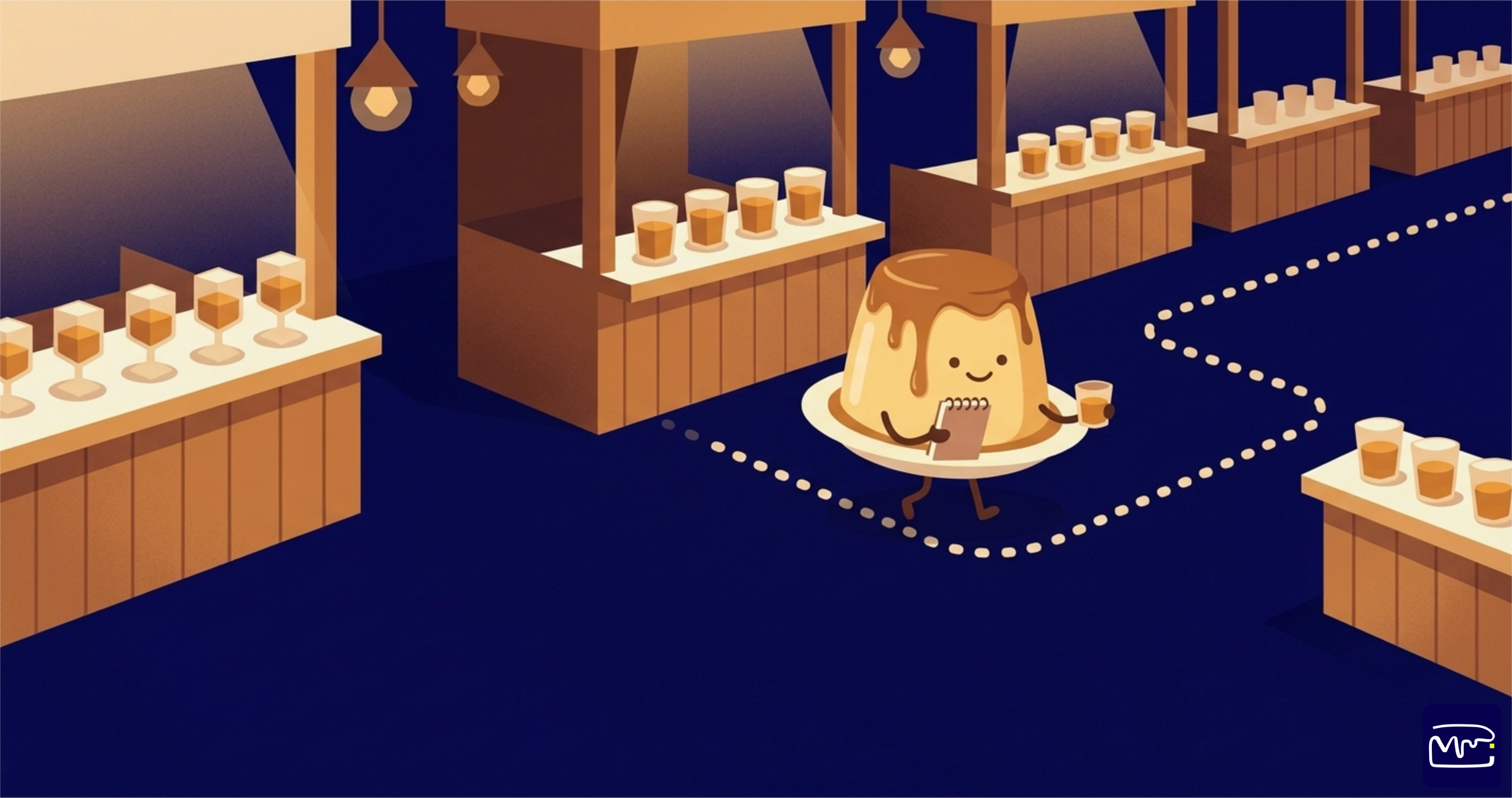
Most of what I know about scoping came from projects with a budget attached. Every so often something smaller teaches the same lesson faster. My dad and I had tickets to The Only Whisky Show in Johannesburg, the lineup ran to 156 whiskies across about forty stands, and I built us a companion app for it over a week of odd hours. That week looked like a client project compressed into seven days.
The brief
The organisers publish the lineup as a web page grouped by brand. That works at home on a laptop. In a busy hall, holding a glass, it doesn't.
We needed to find a whisky quickly, know what it tasted like before committing, record what we drank and what we made of it, and spend the three copper drams that come with a ticket on pours worth the allocation. Four jobs. Everything else was optional, and settling on those four kept the build to a week.
What we built
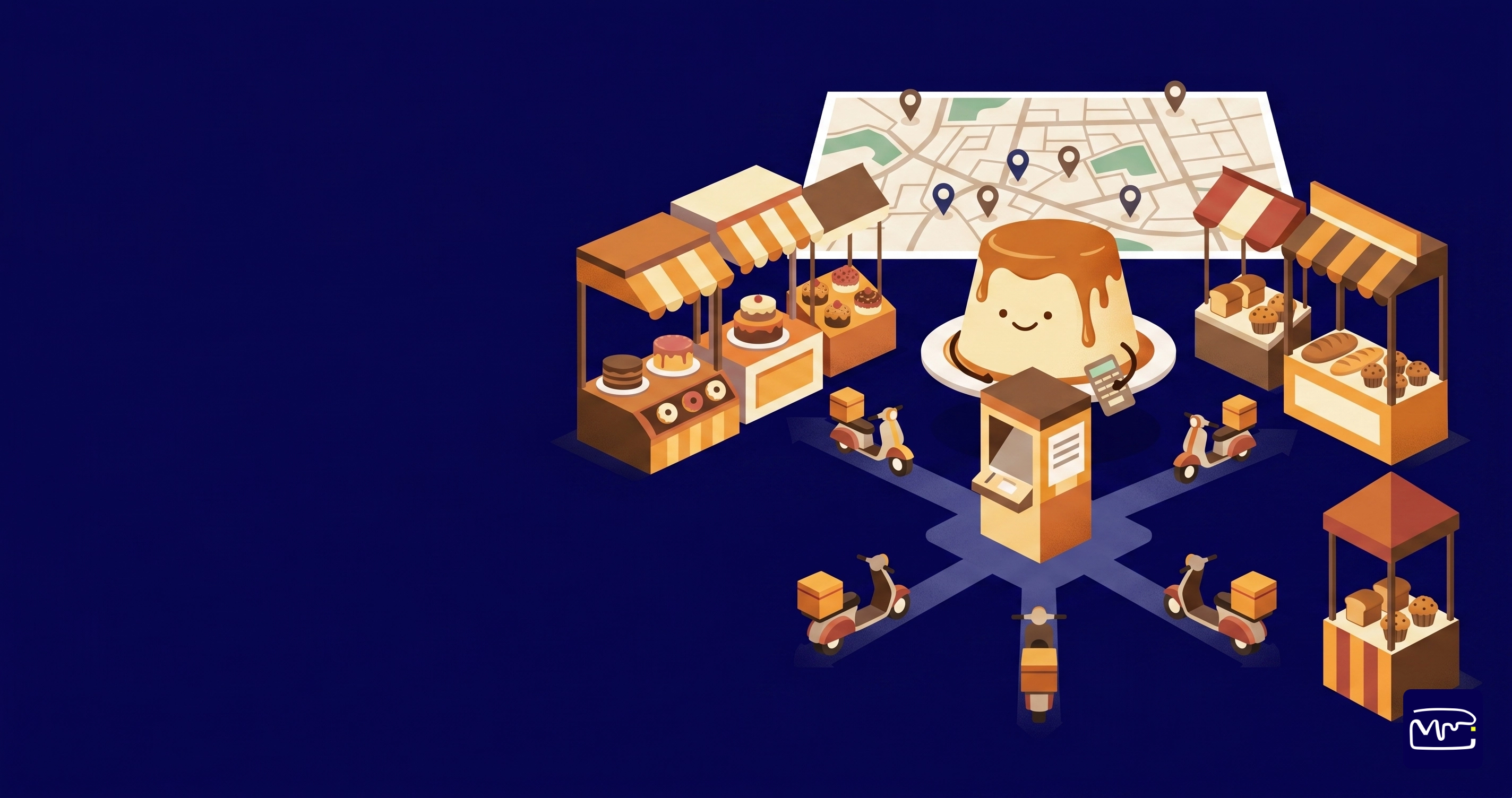
A single page you open on your phone. It lists all 156 whiskies grouped by stand, because that's how you move through a festival. You don't walk to a bottle. You walk to a table and work through what's on it.
Each whisky carries its region, age, flavour profile, a description and tasting notes, plus what a bottle costs in the shop. You tick things off as you drink them, score them out of five and add a note. You can plan a route by adding whole stands and dragging them into the order you'll walk them.
The tasting record lives in your own browser. No account, no password, nothing sent to a server. That one decision removed a login screen, a database and a support burden. Worth asking the next time someone specs user accounts into a first version.
It's still live if you want a look: The Only Whisky Show 2026.
The result
Thirty three whiskies over the evening, averaging 3.64 out of 5. Ardbeg took three of my eight top scores. The best value was the Ardbeg 10 at R890, ahead of several bottles costing three times as much, which is the sort of thing you only notice when the prices sit next to your own scores.
On the build itself, 136 of the 156 whiskies matched to a real price and real tasting notes. The other twenty aren't sold online at all: festival exclusives, society bottlings and unreleased casks. Those cards say so, rather than leaving a blank that looks like a bug.
The lesson
Three things transferred straight back to paid work.
- The data costs more than the screens. Matching 156 festival entries against a catalogue of roughly 1,800 products took longer than building the interface. Names don't line up, and age statements matter, because a 12 year old and an 18 year old are different bottles at very different prices. On client projects this is the migration, and it's the line item people underestimate most.
- Design for the room, not the demo. Dim venue, one free hand, no patience. That ruled out typing, small buttons and anything needing two taps where one would do. Picture a specific person in a specific place and most of the interface decisions answer themselves.
- Say what you don't know. A confident wrong price is worse than no price. The same goes for a project status report.
None of this needed clever engineering. It needed a decision about what the thing was for, and then some discipline about everything it wasn't for. That is the whole job of working out a minimum viable product (MVP), the smallest version that is still worth building. If you're trying to find yours, send me a note and we can talk it through.
Free download: The MVP Scoping Worksheet
Work out the smallest version of your idea that is still worth building, and what can safely wait for version two. Add your name, business, and email and we'll send it over, no obligation, no spam.